Home › Forums › Vectorblade beta test › Title screen and Desktop: Graphics, drafts, …
- This topic has 35 replies, 5 voices, and was last updated 6 years, 11 months ago by
Malban.
-
AuthorPosts
-
June 2, 2019 at 12:29 am #3210
hcmffm
SpectatorEDIT: Please note that I’ve changed the title of this topic. I think it’s good to have a topic/thred per issue. In this topic the graphics of title screen and desktop can be discussed.
Hello Christopher et al,
I’ve just played Vector Blade for the very first time. Vertical shooters are familiar to me but in combination with upgrades and even downgrades this is pretty new. ATM, Vector Blade has the touch of a lottery game to me. Also I have to get used ot its mixture: There are aspectes of Minestorm and Space Invader in it.
Positive:
+ Shooter with a lot of variety in it.
+ Challenging
+ Many levels makes one nosey what comes nextUntil now I’ve played five games:
1.) 19.500 points, Level 18?
2.) 22.000 points
3.) 45.000 points
4.) 50.000 points
5.) 25.000 pointsHardware/Software:
VB beta 10 on non-buzz VectrexBugs/Problems/Isssues:
#1 Calibration: It’s impossible to 100% “STRAIGHTEN THIS TEXT” – even when using the buttons to straighten step by step there is a jump and you cannot straigthen it 100% on my machine. (This has been reported, already.)#2 Calibration: Square: It’s unclear what one should do here. I assume the square should fully fit one the screen.
Suggestion: Perhaps a short note or some graphics (e.g. arrows which point to the corners) might make this calibration step easier to understand.#3 Calibration: Small symbol in the center: Again, it’s unclear what one should do here. I’ve adjusted the symbol so that it looked symmetrically but the symbol is very small and I couldn’t recognize what the symbol is.
Suggestion: Perhaps a short note/sample what the symbol should look like. Larger symbol.#4 Explosions in level 94: Peni5es!?
O.k., this one is a bit embarrassing. When waiting for a while, the autoplay of the game begins. IIRC, the game played level 94 and I was a bit surprised to see explosions which looked like penises. I looked again it’s pretty obvious. O.k., I admit I’m a bit biased because we have graffiti sprayers here in Frankfurt and they sprayed a peni5 symbole on a tree.#5 Menu graphics: inconsistent look
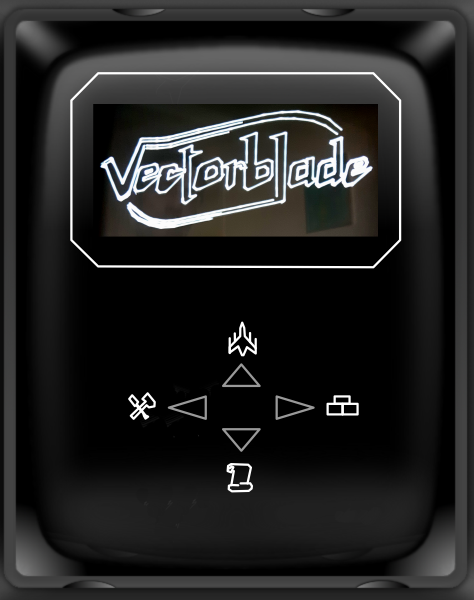
The main menu with the four arrows looks a bit inconsistent to me: There’s the very fine and small symbols for “Info”, “Rank”, “Play”, and “Settings” and on the other hand there are those huge arrows.
Suggestion: Larger graphics if possible. Arrows a bit smaller.It’s very late, now, I’ll post more stuff tomorrow.
June 2, 2019 at 5:26 am #3211Peer
SpectatorHey Helmut, welcome! Great to see you here as well 🙂
Don’t worry. The upgrades and downgrades lottery initially was confusing for me too, but I very quickly learned about it the hard way. I am still prone to accidently catching all the downgrade stuff, but that is part of the fun / challenge.
Regarding your #1: At one point in time I had that on one of my machines, but not on the others. I do not recall which beta version it was, and it was gone in the next beta. I think I saw it again in yet another beta, but by then I was focussing on the VIA stuff and did not pay any closer attention. Will do so now. This is probably console specific.
Regarding your #3: On some consoles I manage to get the small symbol “closed”, i.e. the endpoints of the outline meet, on others I cannot get it “closed”, the endpoints will never meet.
June 2, 2019 at 7:37 am #3213Malban
KeymasterWelcome aboard.
This is just a short welome message – I have to go hiking now, I will look at your post this evening… Cheers!Malban
June 2, 2019 at 3:07 pm #3217KeymasterHi,
I am back, but I dunno if I’ll do any Vectrex today – it’s to warm to think straight – for me anyways.Regarding your findings:
1+2+3) Yes, the whole calibration thing needs a make over… it is on my todo list.
But still, even than it might be, that I won’t explain everything on screen. VB is supposed to come with an instruction booklet… But nothing decided here – just that it needs a make over.
The speed of calibration: pressing button 1 or 2 increas/decreases the calibration in “single steps” – if your beta already supports it.
Also – regarding 3. The small thing – you probably can’t get that perfect. It is one of the swarmers around the Queen. They are drawn TO FAST for the vectrex to handle (on purpose) – so here you can chose whatever you like best 🙂4) Wellll….
Since the beginning of time (computer times) there have been space ships looking like male genitalia. Often times it was coincidence.
Even if I like making reference to other programs – this time it is not.
The ship (which one is it exactly? The Klingon?) explodes with exactly the same routines as all other ships. If that just happens to leave a flash of impression of male genitalia… I can’t help it. Actually you are the first to notice that (or at least the first to say it out loud).5)
Yes, good point. I never was completely happy with the looks. I’ll try it.BTW
Do you have access to a Eprom burner? Otherwise you will not see any changes…Regards
Malban-
This reply was modified 7 years, 1 month ago by
June 2, 2019 at 7:23 pm #3227SpectatorThank you, Malban and Peer for your warm welcome and your feedback.
In my initial postings I have been very brief, below please find some more explanation
Re: #1 I test on a non-buzz Vectrex and from what I have read in the other post straigthening using the joystick is fast. I’ve tried the buttons instead and found that a 100% straightening isn’t possible: In my case a setting in between two values would have been needed to get the text straightened.
Re. #1-3 Good to read that calibration will be redone a bit. It’s not bad but it should be more self explaining and intuitive.
Re 4: I tried again this afternoon. It’s the clingon ships that look like a male genital when exploding. I guess there’s little you can do but I’ll take a photo that you (and myself) can see what it really looks like.
Re 5.: Cool that you will have a look at this one. I’ve created some drafts, see below. I think it would be a good thing if title screen and desktop would be combined into one screen. But I guess that’s impossible due to the Vector Blade logo. But again, perhaps the Vector Blade logo could become part of the “film” shown on the desktop with the credits.
Best regards,
Helmut
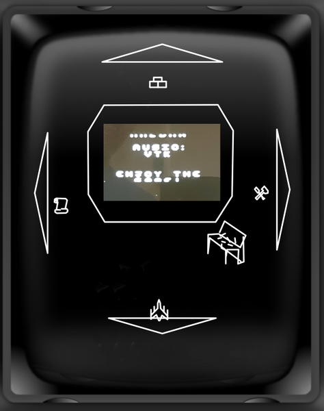
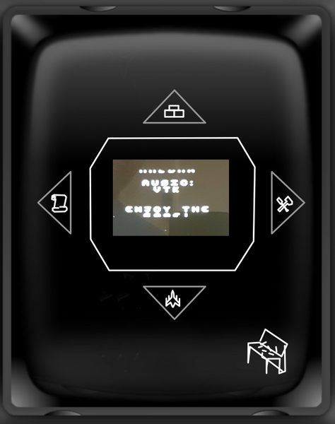
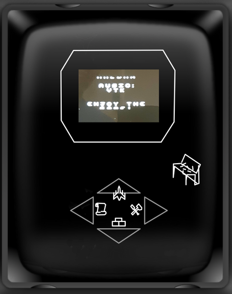
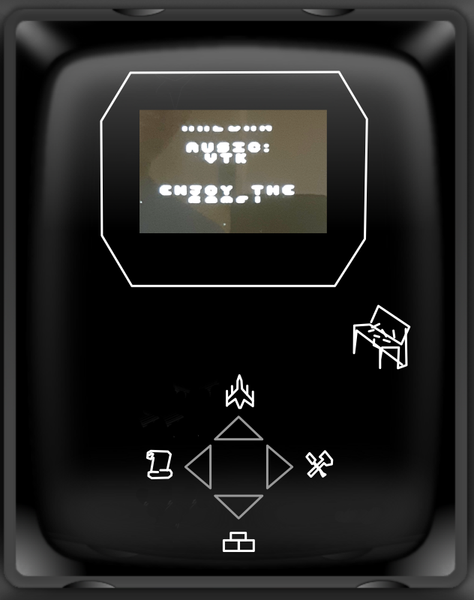
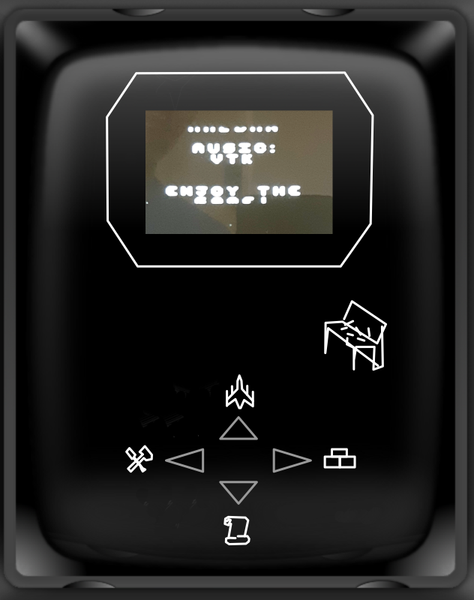
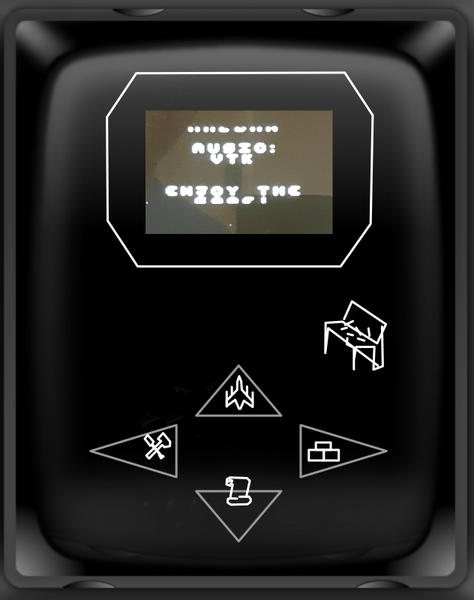
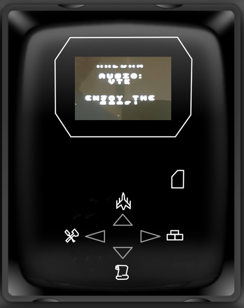
#5 Drafts for “desktop” screen.
Original 1
Draft 2
Draft 3
Draft 4
Draft 5
Draft 6
Draft 7
Draft 8
 June 2, 2019 at 7:54 pm #3229Keymaster
My favourite from a first impression is draft two.
Beta Testers!: Thoughts?
June 2, 2019 at 8:07 pm #3230SpectatorA short addendum to the above drafts:
Please note that I’ve changed the position of the items. I think “Up” and “Right” are (more or less) “Forward” directions while “Down” and “Left” are “Backward” directions. Therefore, “Play” and “Highscores” should be placed on “Forward” positions while “Settings” and “Description” should be placed on “Backward” positions.June 2, 2019 at 8:52 pm #3232SpectatorBelow please find a sample what the combination of the title screen and the desktop might look like. Idea behind this is that the logo is part of the movie and is shown/scrolled vertically just like any other content (credits, …).
(I removed the control desk for the pilot to clean up the screen. The control desk might be added, again. Perhaps the perspective of the desk might be changed so that it matches the perspective of the movie screen and the menu)
Draft: Title screen and desktop united
-
This reply was modified 7 years, 1 month ago by
hcmffm.
June 2, 2019 at 9:05 pm #3234KeymasterHm…
The nice Vectorblade spaceship flying by will be missing *tear dropping* :-(.
Also I have to test it out – if cycle wise there is any possibility that it might work…And its not fitting for draft #2…
Thanks for all your thoughts and drafts!
Really appreciate it!
Malban
-
This reply was modified 7 years, 1 month ago by
June 2, 2019 at 9:06 pm #3237vtk
Spectatorhi Helmut sorry for the late message to say hi and nice u are here 🙂
June 2, 2019 at 9:12 pm #3239Spectatormy favourite is the same as you Chris, DRAFT 2
June 3, 2019 at 4:57 pm #3249SpectatorThank you, vtk, for your welcome! Where are you located? Somehow I have the feeling that we know each other, arleady.
The nice Vectorblade spaceship flying by will be missing *tear dropping* :-(.
Also I have to test it out – if cycle wise there is any possibility that it might work…And its not fitting for draft #2…
Hmm, perhaps its just a matter of rearranging things: Instead of two separate screens (title screen and desktop) it might be just one screen which “morphs” into another. This would also solve the problem of starting a short music on the title screen and stopping it again after just a few bars.
A sample script for such a morphing:
1. VB logo appears
2. Spaceship animation is shown
3. VB logo gets smaller (or disappears) and screen (frame) around logo appears.
4. Menu appearsNot a perfect script, yet, but perhaps a direction to think further…
June 3, 2019 at 5:17 pm #3252Keymaster“Usually” it is not difficult on a Vectrex to zoom in or out, since it is just a scale factor.
Thing is – I draw most things with very specialized routines, amongst others, specialized in using a fixed scale factor.
I do a little bit zooming with the space ship on the title screen – and this already doesn’t look to good (many bright spots).
That would increase if I zoomed out the title string, and would not look really well.
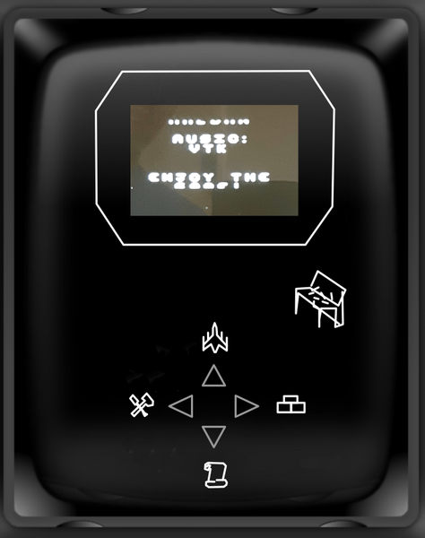
I’ll keep thinking…I don’t know if you monitor the “upload” thread, I just uploaded a new beta… here a screen of DRAFT #2:
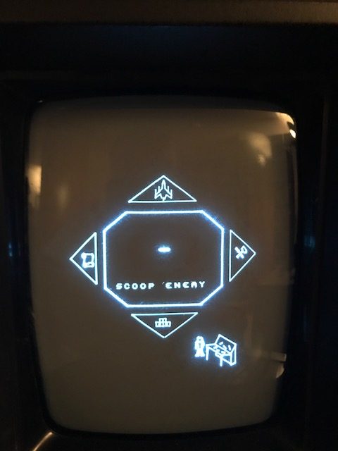 June 3, 2019 at 6:01 pm #3253Spectator
I also would have voted for draft #2 🙂 Will take a look at the new beta now.
June 3, 2019 at 11:11 pm #3269Spectatorhcmffm said: Thank you, vtk, for your welcome! Where are you located? Somehow I have the feeling that we know each other, arleady.
i am in the UK,
i think we have chatted before yes perhaps on the facebook group or one of the other vectrex forums 😀 -
This reply was modified 7 years, 1 month ago by
-
AuthorPosts
- The forum ‘Vectorblade beta test’ is closed to new topics and replies.